I don’t really have a great color post but I sooooo want to join the party. It looks like so much fun and I’m really having a good time reading all the party links. There are some really great ideas out there and really talented people coming up with these ideas.
What to do? What to do? Think I can shuck and jive and sneak a COLOR INSPIRATION post in?
If people can crash weddings and SOME people can crash White House events, surely I can get away with crashing a really cool Color Link Party? Maybe no one will notice it’s not really a project and just focus on the color.
O.K. here goes…
1. The PINK poodle
Cool, huh? What a great idea. I walked behind this guy in our town’s breast cancer walk last fall. I was in awe. I’d say perfect pink for the cause.
2. Green apples
My go-to quick decorating secret to add punch and pizazz when guests are coming. Just run to the grocery and pick up a bag of green apples and disperse them in containers around the kitchen, dining room, and living areas. Instant success.
3. The orange crush chair
I really am gonna be posting about this guy next. Hold your thoughts.
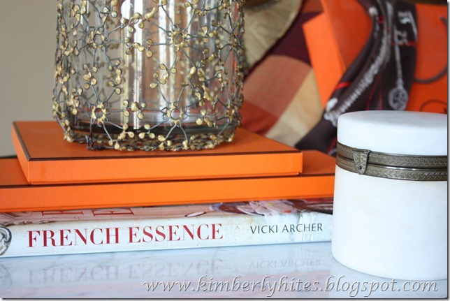
Can this pass for Hermès orange?
O.K. I’m on an Hermès kick. And for some reason I’m into orange now.
4. What about stacking up Hermès boxes for instant color?
It would probably help if you had more than two boxes! lol
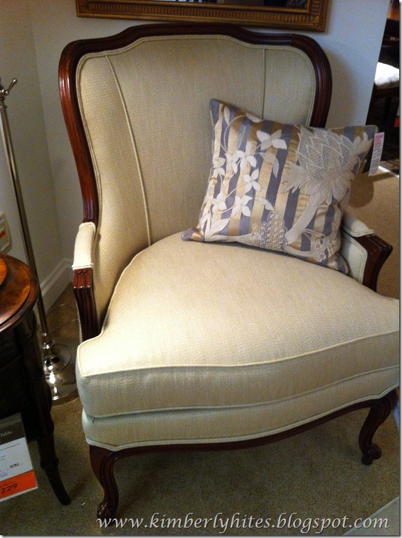
5. Upholstery spotlight
I’m re-thinking about upholstering everything in my natural linen/cotton blend. Drama, people, drama. Not in life, just interiors.
I’m lovin’ this vibrant orange-red. May I borrow a pair of sunglasses?
6. Current color of daughter’s room: Rye Grass Green.
Don’t paint your rooms rye grass green. No really. Trust me. I already sacrificed for all of us. Reminds me of the Direct TV commercial, “If you paint your walls a rye grass green you’ll end up in a roadside ditch. Don’t end up in a roadside ditch.” Need I say more?
You know how we say sometimes, “It looks better than the picture shows”? The pictures actually make the color look good. It’s not. Again, trust me on this one.
And, now I’m just cheating using photos from outside.
7. Re-purposed cobalt blue Arizona tea bottles for vases.
Bright colors against white even make the white look crisper.
And, the piece dé resistance?
8. A blue Jasper cabinet.
That I can’t get rid of. It was my mother’s 25th anniversary present from my dad. Looks like I’m gonna have to work around the teal blue color or incorporate it in my new den office. I have no choice on the color in this situation. Stay tuned for that, too.
Love it!
My design style is slowing moving in the direction of color even though it doesn’t seem like it now. I’m painting with neutral backgrounds, but I want to add pops of color. More trés chic I think. More memorable I think. We’ll see…
That’s the real reason I’m so interested in this party. And, the hosts are really cool.
Au Revoir,
Kim
Linking to:


